Heimen Hotel by De Bergenske gets new costume
De Bergenske
A hotel with history
Heimen Hotel, formerly known as Hordaheimen, has since 1918 been a home for visitors from all over Hordaland. Today it remains a home, but for visitors from all over the world. Together with De Bergenske, we have developed a holistic concept and a visual identity that sharpens the hotel's position in the market and makes it a clearer, warmer and more local alternative.
A concept built on true hospitality
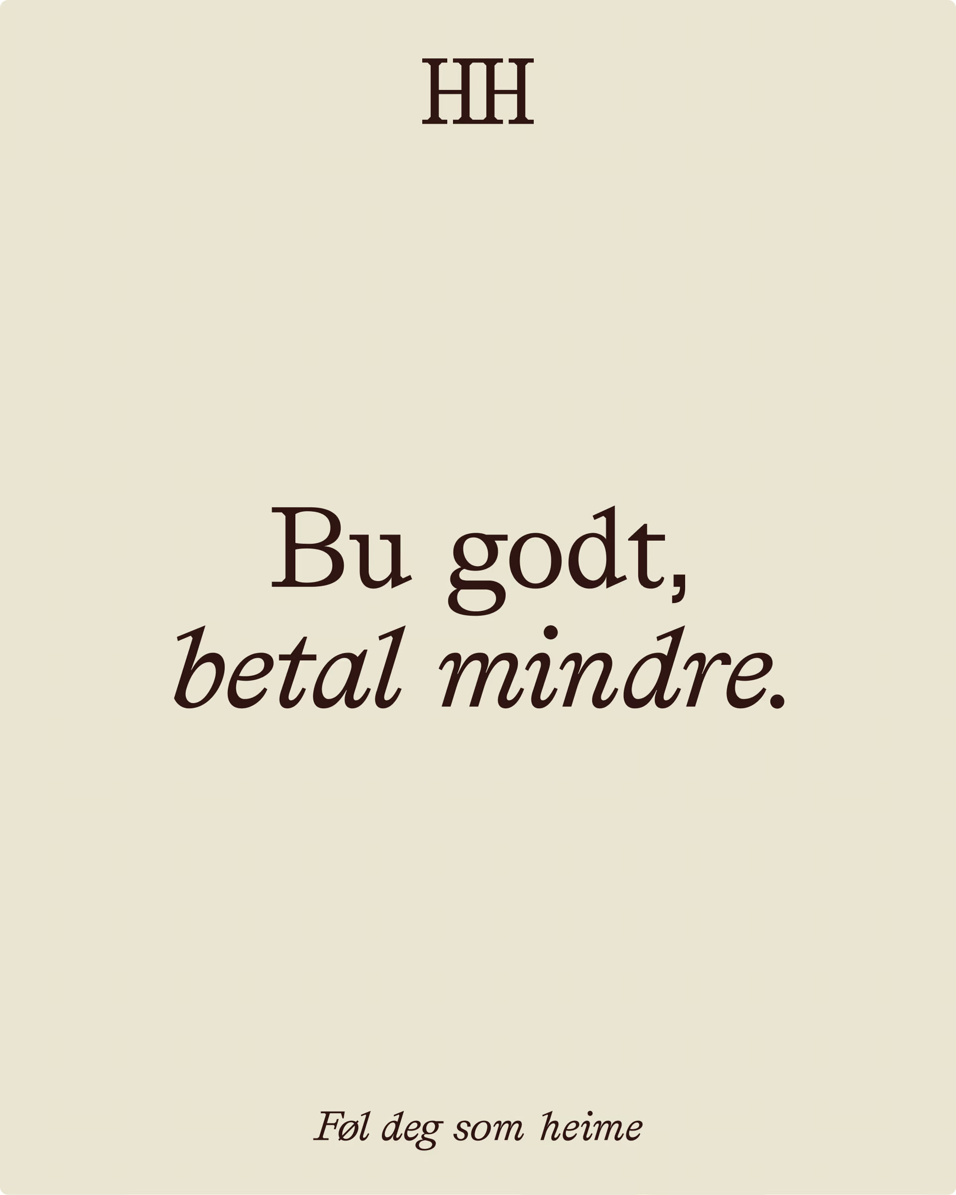
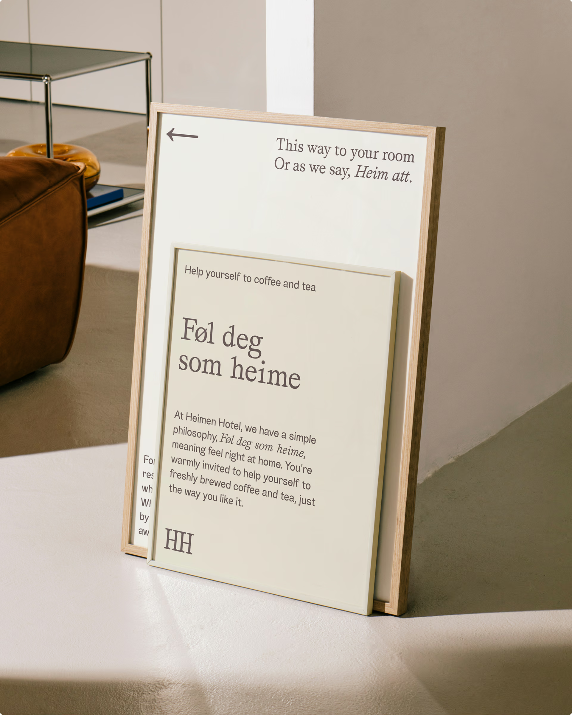
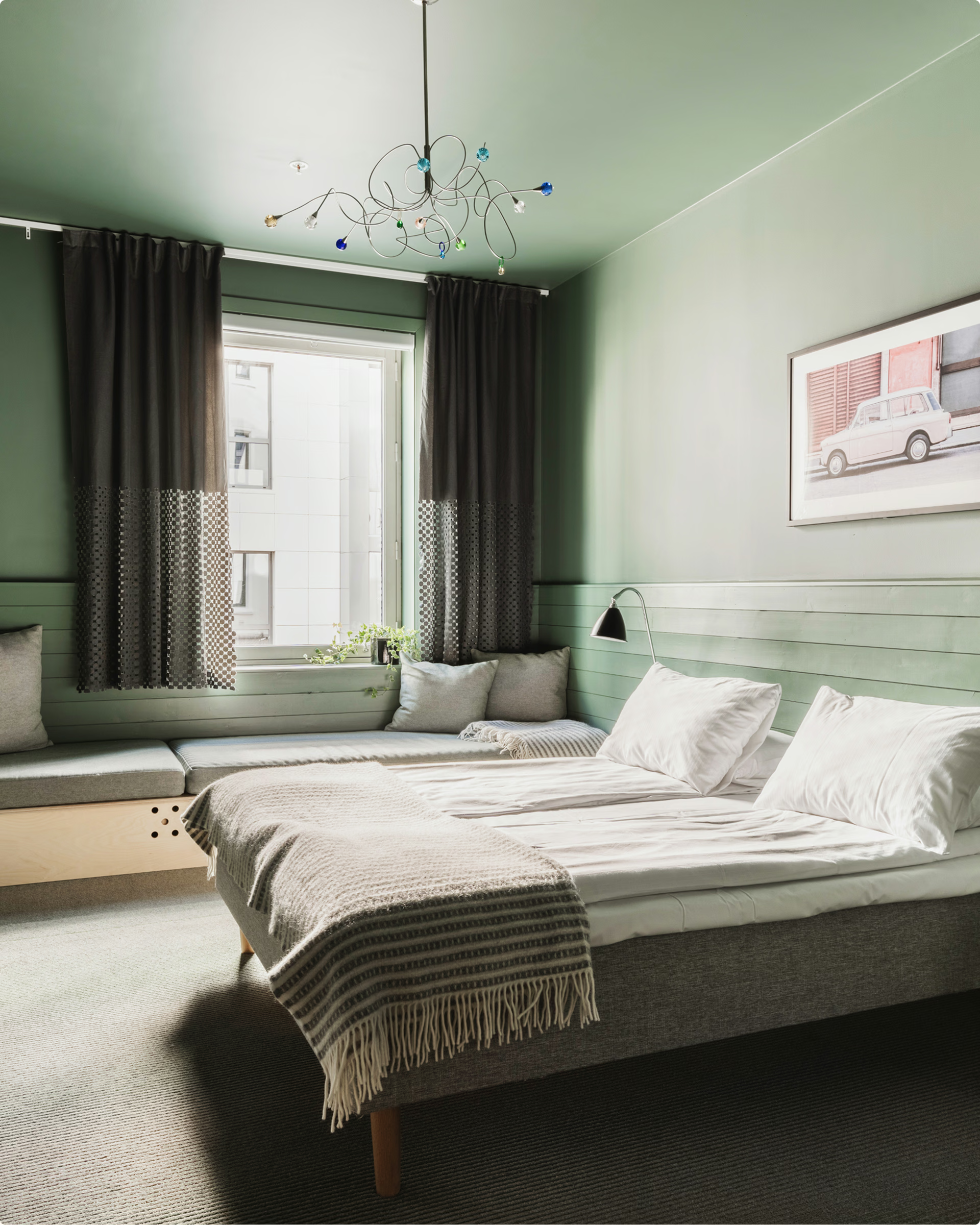
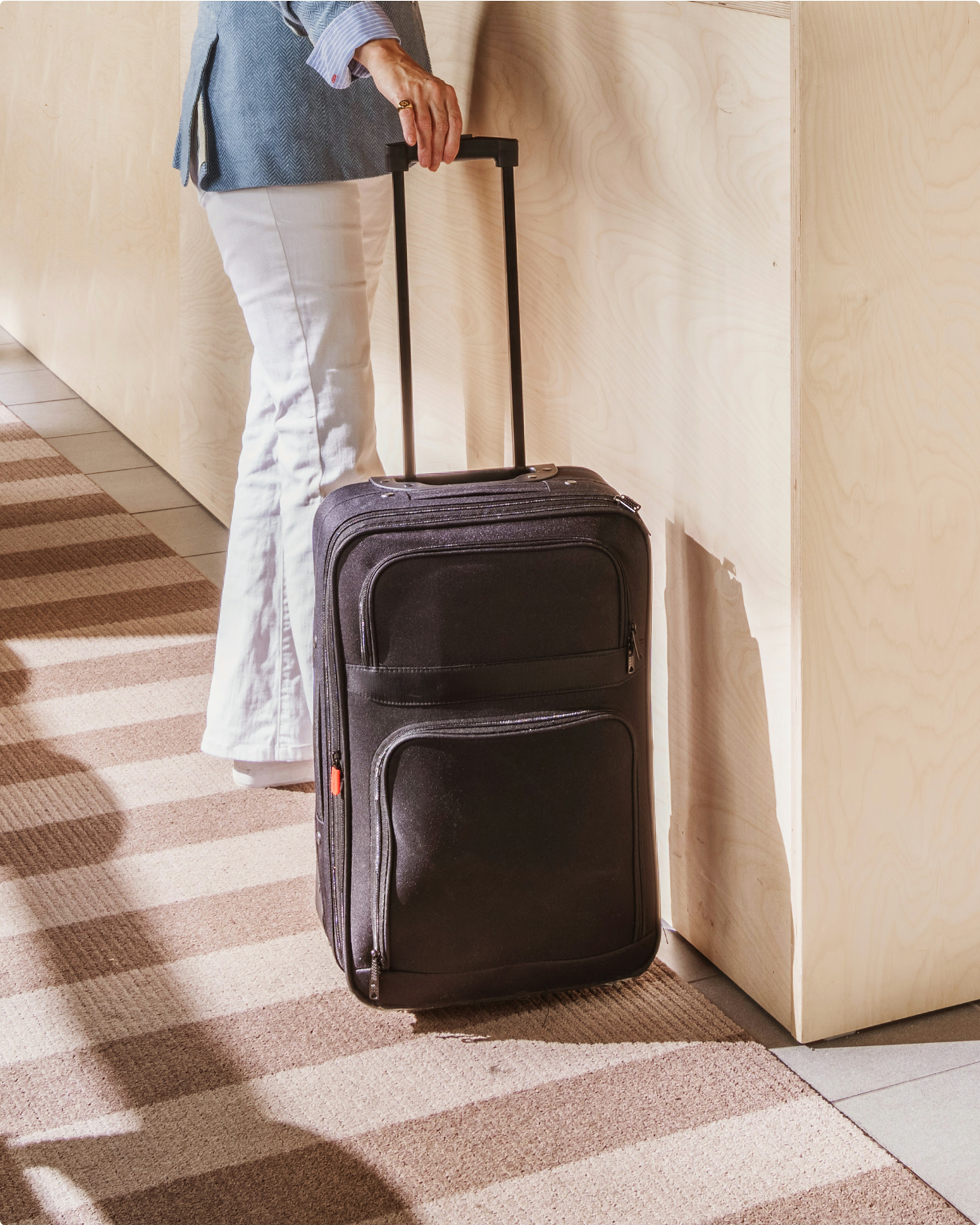
The hem was not to be smoothed out, it was to be raised forward. The hotel is unpolished and genuine, and this is also the core of the new expression. “Feel like heime” became more than a promise. It became a guideline for everything: From how to check in, to how it actually feels to be there.
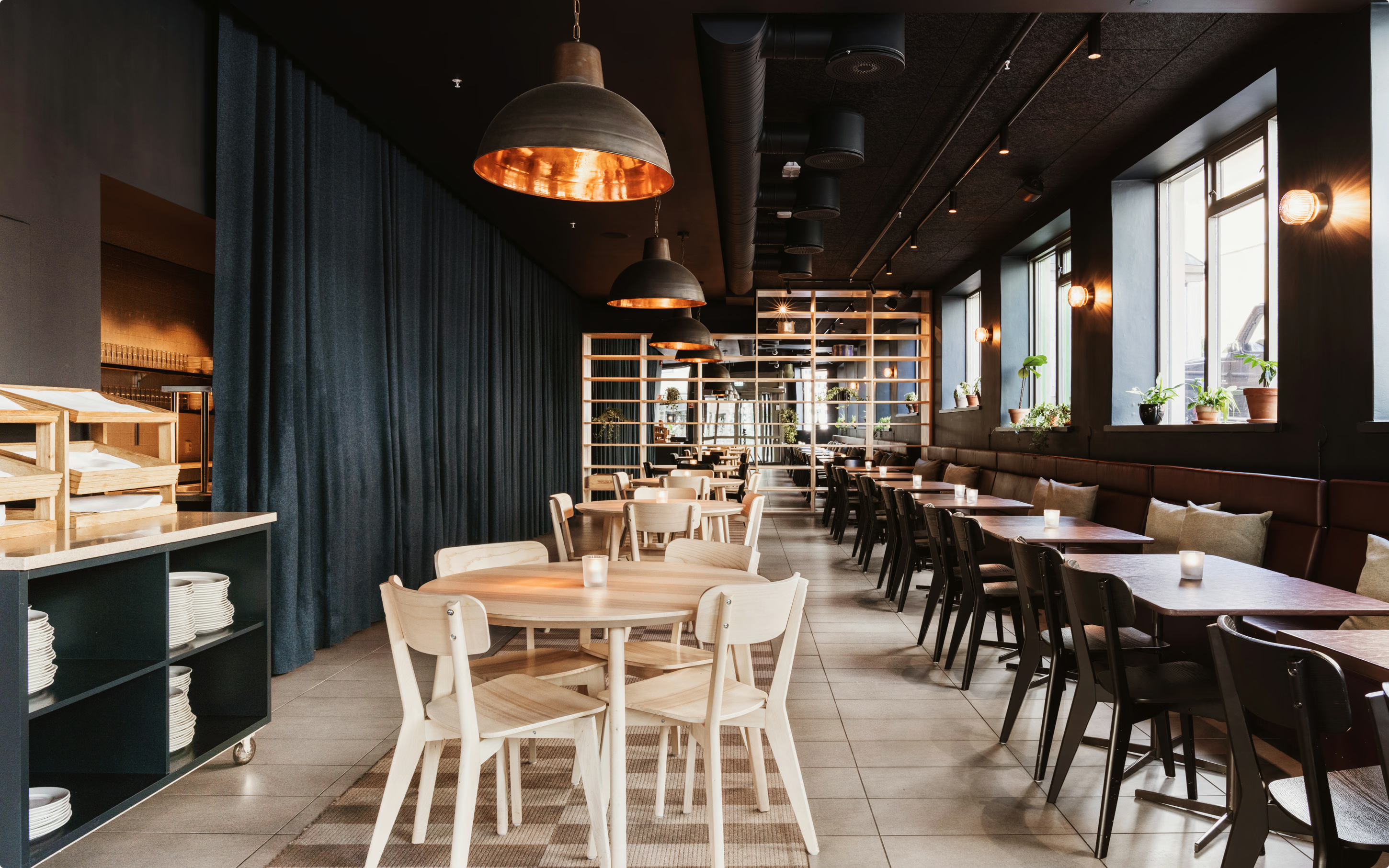
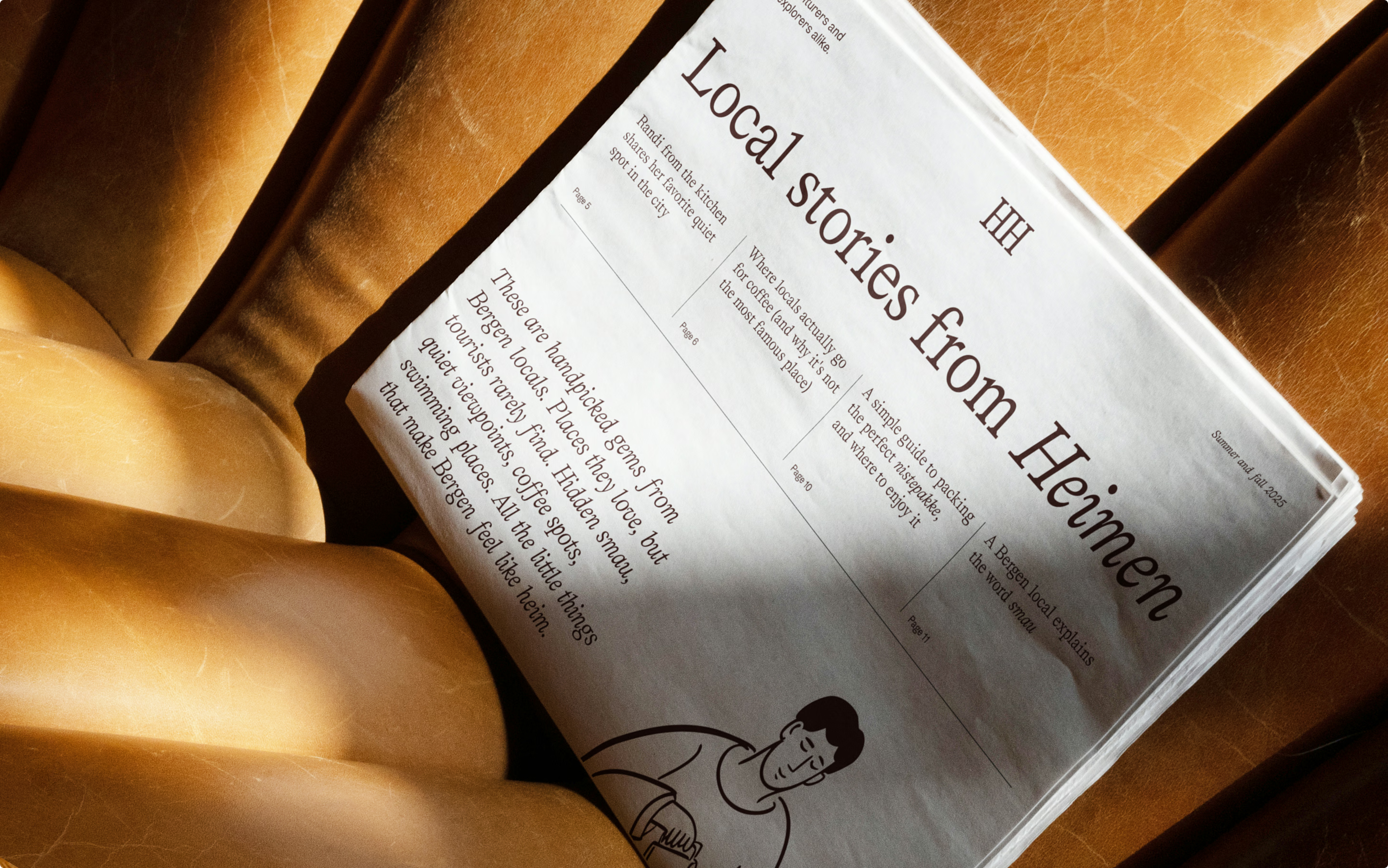
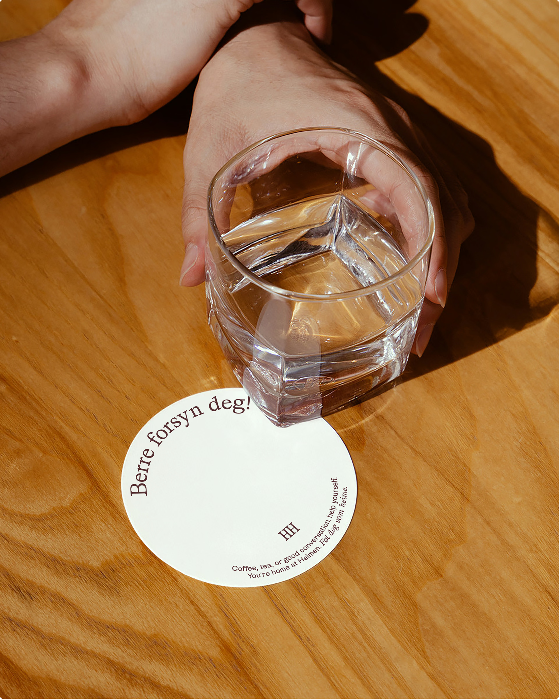
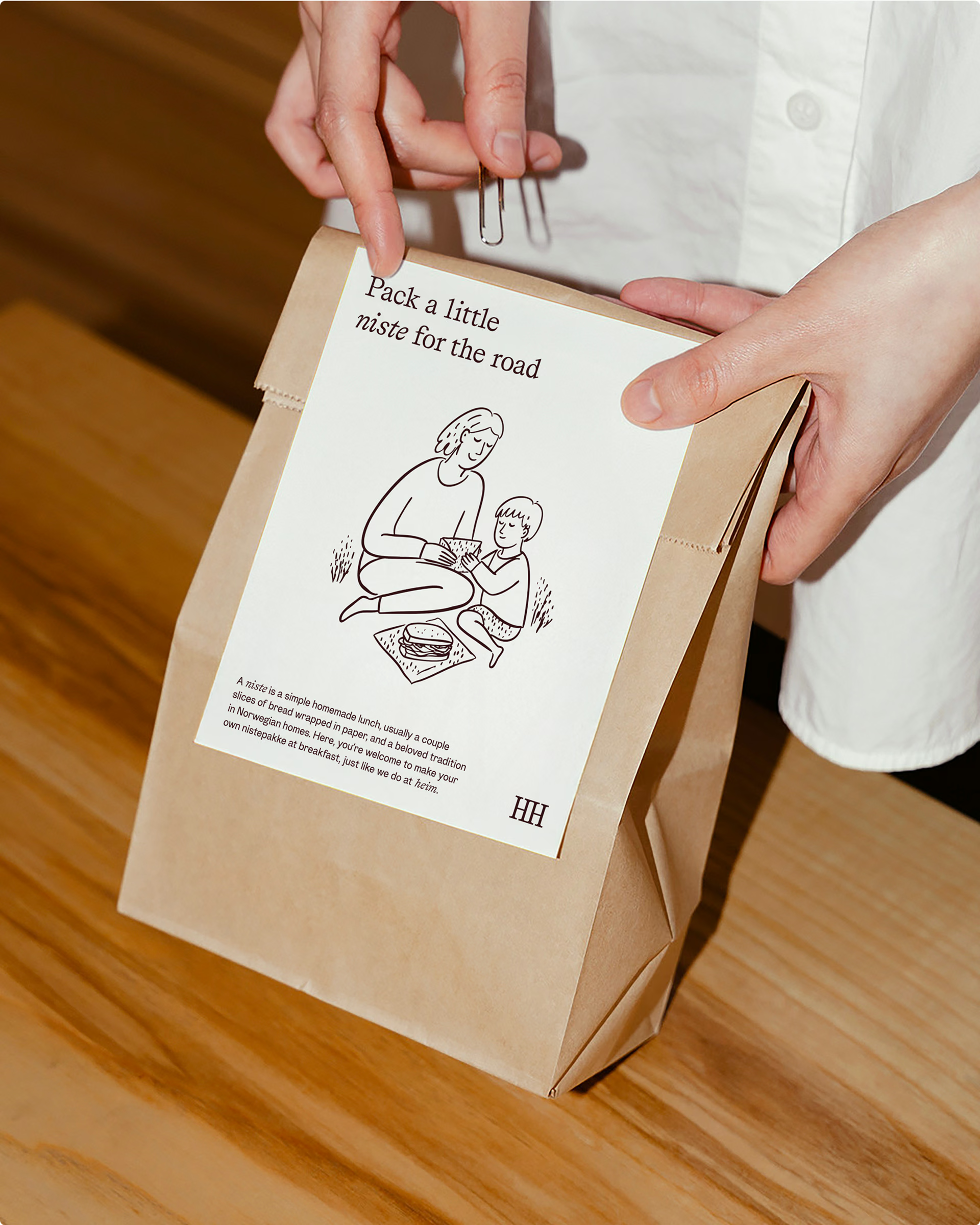
The atmosphere is relaxed and sociable. Coffee and tea are always ready, and you supply yourself, just like at home. Breakfast is casual, with homemade Norwegian favourites such as svels and brown cheese, and a natural urge to smear with your own porcupine. In the room is a self-produced newspaper, filled with local tips and little stories from the city. Not leaderboards. Not tourist traps. Only Bergen, for real.
A holistic expression
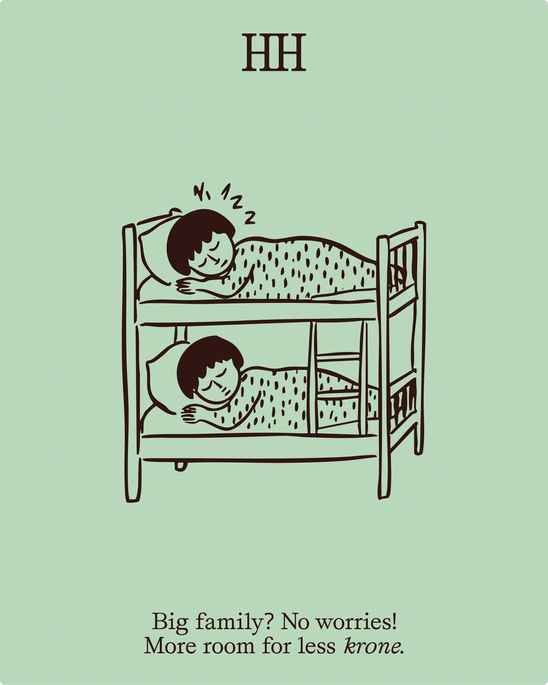
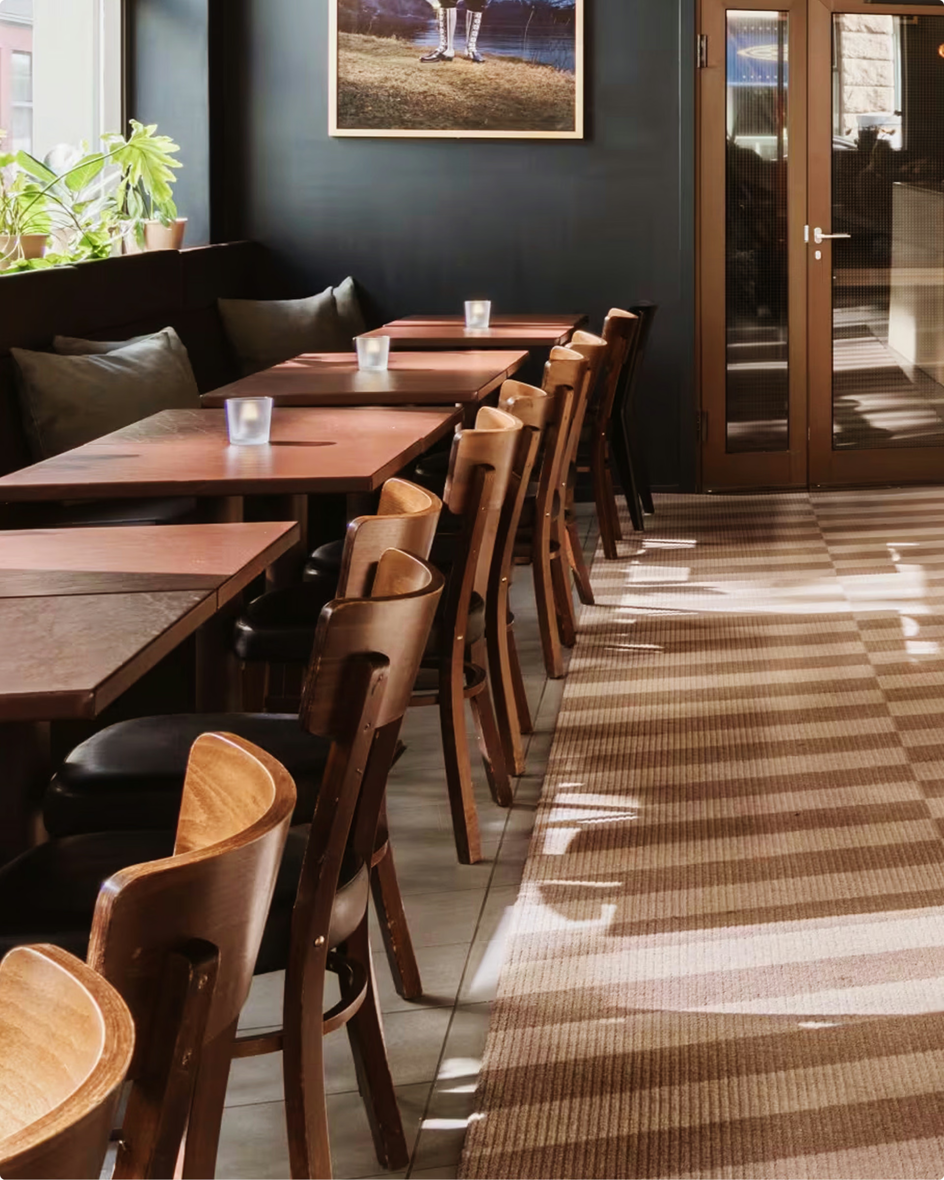
The visual identity combines a simple, modern expression with clear references to Western Norwegian idiom. Illustrations highlight small fun facts and traditions from Norwegian hospitality and give identity a charming, human touch. The image style is honest and warm, focusing on the close and sensual. The whole concept is designed to give the feeling of being visiting someone's home.
The language tone is reminiscent of a Western Norwegian hostess. Nynorsk is not just a style choice, but part of Heimen's hospitality. It gives the hotel a warm and unvarnished tone towards Norwegian guests. It is also lifted into English surfaces where appropriate. Words like “niste” are allowed to stand, with small explanations that open up cultural understanding. That way, language becomes part of the experience, not just communication.
The Heimen Hotel has become something more than a place to sleep. It is still a reasonable option, but now with an identity that is felt.
• Together with De Bergenske, we have developed the concept and visual identity for Heimen Hotel — formerly known as Hordaheimen. The task was to make the hotel clearer and more relevant to new audiences, without removing what makes it unique. We kept it raw and real, and lifted it forward.
• “Feel like heime” became the guideline throughout the work — from breakfast experience to image style and design. The identity is based on Western Norwegian idiom and carpentry tradition, with warm colours and human illustrations creating a homely atmosphere.
• The result is a hotel with soul, which feels more like a visit to someone's home than a regular hotel stay.